
Overview
PACT, a large insurance provider that’s been doing business for over 30 years, was looking to sell prepackaged insurance policies online for the first time and, as a result, needed to build a mobile-responsive website from the ground up.
Historically, PACT had been a B2B company, relying on regional agents to sell their 350+ offerings to individuals and businesses across local markets. However, to remain competitive, they knew they needed to start selling packaged policies direct to consumers, eliminating the need for a middle man. More specifically, they wanted to focus on attracting young, digitally-savvy consumers in the market for insurance, some for the first time. In order to build a competitive, digital-first product, they knew they needed to first answer the following questions:
- Who is PACT’s ideal customer?
- What types of insurance products are most desirable to young consumers?
- Which factors (price, deductible, co-pay, etc...) are most influential in determining a customer’s choice of policy?
- What are the biggest pain points customers encounter when selecting an insurance provider and plan?
- Which aspects of an insurance policy are most important for customers to be able to customize vs. having pre-packaged for them?
Research and Analysis
To answer those questions and begin to formulate a product strategy, I first conducted secondary research in the form of a competitive analysis, evaluating other insurance companies currently in the market to better understand their product offerings and intended customer base. Special attention was given to the types of policies offered, online purchase flows, their mobile/tablet experience, and their “request a quote” features.
Competitive Analysis of Major Insurance Providers in the Market
Once the competitive analysis was complete, 30 minute 1:1 user interviews were conducted in New York, Atlanta, and London with digitally-savvy consumers in their 20’s and 30’s to uncover what they did and did not know about the insurance market. To provide additional context, a quantitative survey was sent out to 91 respondents across the country to determine how consumers of various demographics select a policy, measuring sensitivity to things like price, risk, and the ability to customize one’s coverage.
From those primary research methods, I derived the following key insights, which were then used to form the foundation of the overall product strategy:
- Consumers prefer to compare providers online as opposed to using an agent or 3rd party broker
- The ability to customize one’s policy was important to the majority of those surveyed
- >90% of respondents agreed with the statement “having health insurance is a necessity”
- Premium cost and overall coverage levels were the most important decision-making factors
- An overwhelming majority found policy information too complex to understand
- Renters and auto insurance were the two policy types most commonly purchased by individuals, as they’re rarely provided by employers
- Users desired greater transparency about what their plans cover, written in language they can actually understand
- Users wanted insurance websites that were easier to navigate, with quote tools that required fewer steps to complete
- Insurance providers’ websites typically didn’t work well on users’ mobile devices
- Many users didn’t like having to talk to a representative over the phone: saw it as an unnecessary headache that could be avoided
Defining the Deliverables
With those key insights on hand and plenty of valuable user quotes from the 1:1 interviews (ex: “I don’t want to think about life insurance right now. I don’t even know if I have a life insurance policy, I’d have to ask my parents.”), user personas were developed to guide the feature development and overall UX strategy for the website. Included in those personas were characteristics like: personal goals and frustrations, existing brand or product affinities, and general knowledge of the digital landscape.
From there, I constructed an empathy map to evaluate the internal and external factors that would motivate a consumer to purchase (or avoid purchasing) an insurance plan online. The overall objectives of the project were also outlined before moving into the next design phase, finding ways to reconcile the company’s business goals with user needs and the technical considerations that had to be taken in to account
Primary Persona Used for Product Development
Empathy Map Built upon Interview Findings and Persona Development
Information Architecture & Site Map
Once personas and key features had been decided on, an open card sorting exercise was conducted to inform the construction of a site map and determine how various products and policies would be grouped together on the site.
Participants were given index cards with 25 distinct insurance products and asked to sort them into whatever categories they saw fit. Once complete, they then named the categories based on what they perceived to be the shared characteristics of the products in that category. The results were compiled and analyzed before being translated into a site map.
Preliminary Site Map Built from Card Sorting Findings
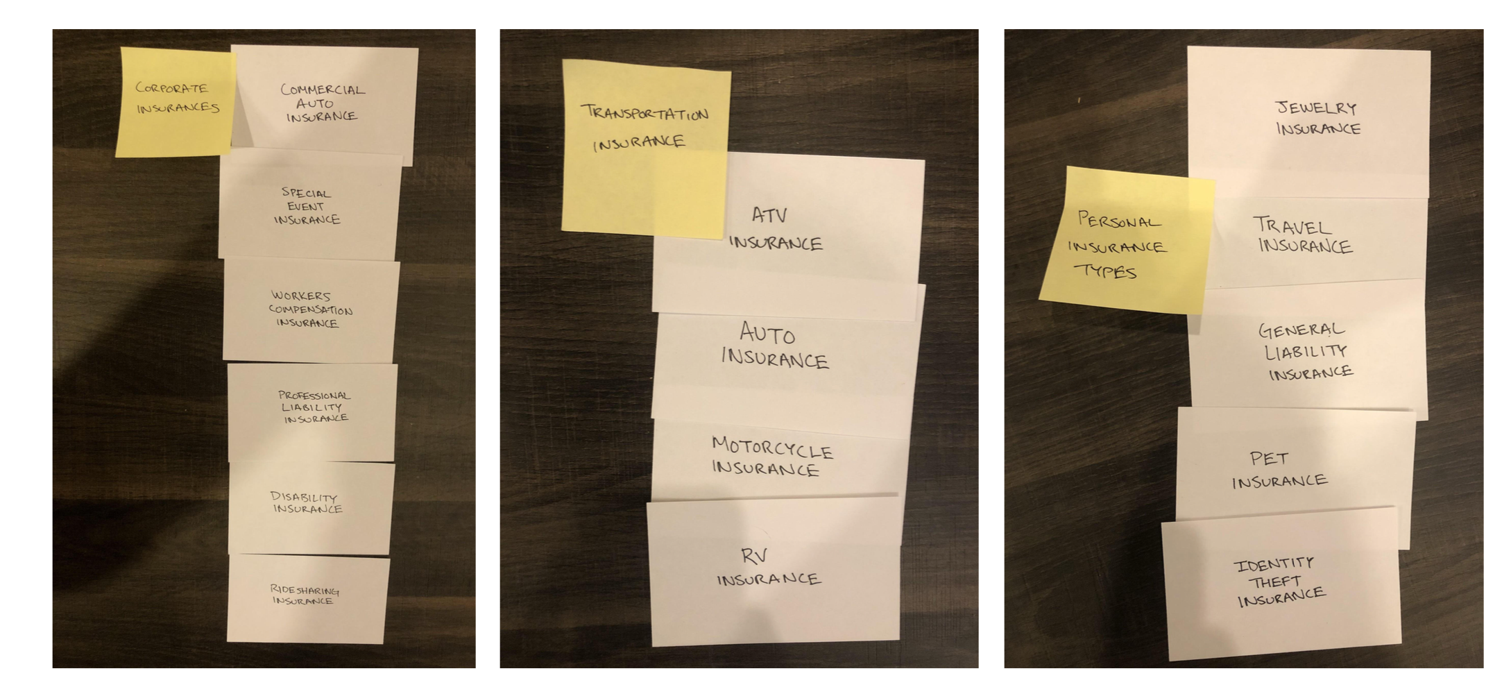
Results from the Open Card Sorting Exercise
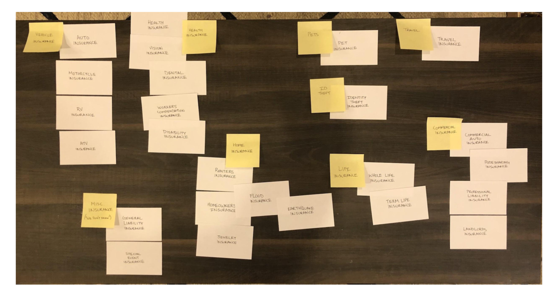
Results from the Open Card Sorting Exercise
Interaction Design and User Flows
Following the creation of a sitemap, key task and user flows were drawn out to determine the key screens needed for initial sketching exercises.
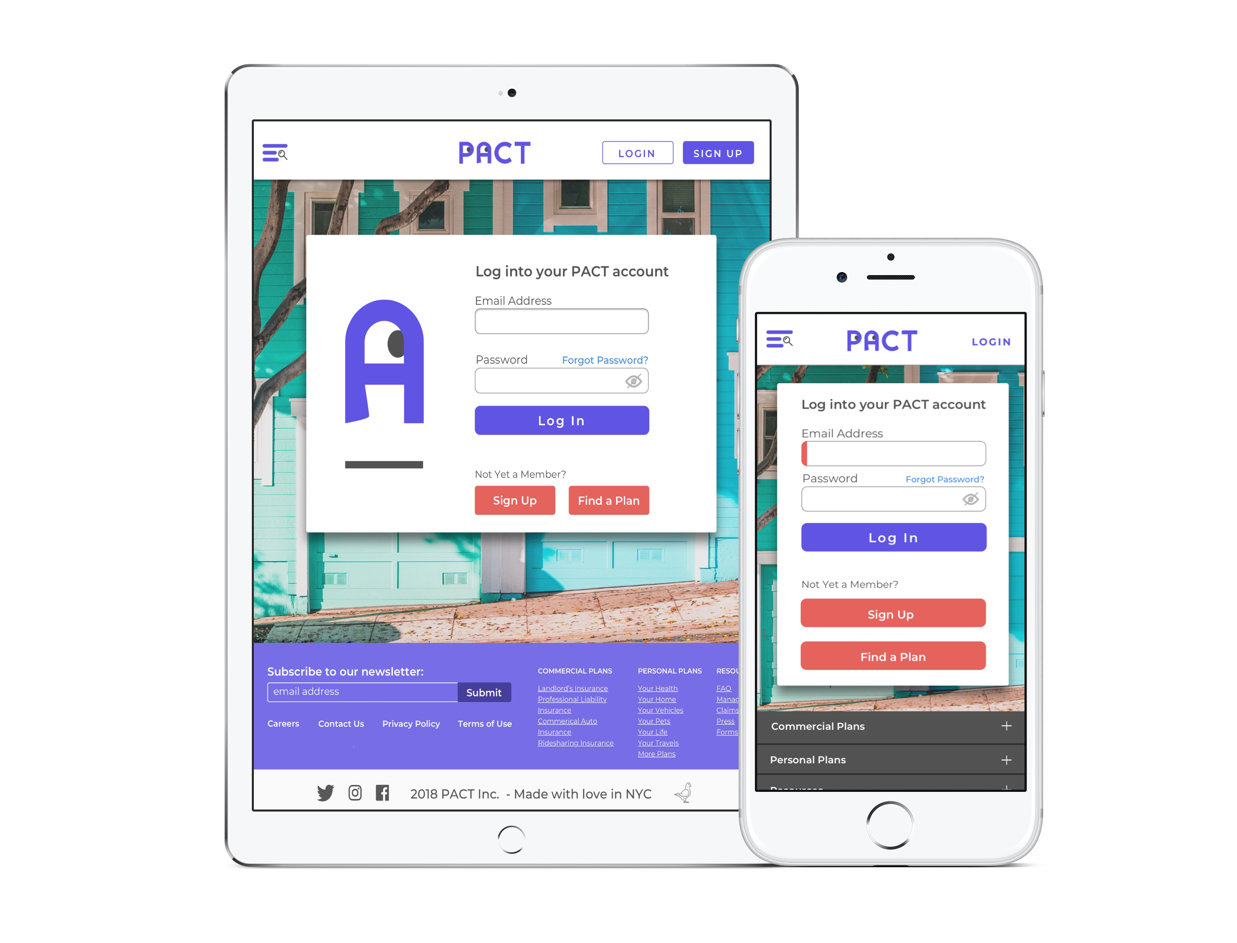
Wireframes were then constructed and annotated for these screens across desktop, mobile, and tablet, outlining the placement of high priority features such as the chat module, the “get a quote” tool, and the customer testimonials section.
Primary Task Flow for the PACT website
User Flow Highlighting Various Entry Points into the Conversion Funnel
After wireframing was complete, a logo, brand color palatte, and UI kit were developed to help inform the initial frontend look and feel of the site.
Typography and photography styles were chosen to best reflect the brand values and special consideration was given to various aspects of the site’s interaction design including: user feedback mechanisms, hover states, and critical tasks like signing up for and logging into an account.
UI Design
Primary UI Kit
Using the UI kit, the first version of screen mockups were created in Sketch and imported into Marvel to build a functional prototype that could be tested with users.
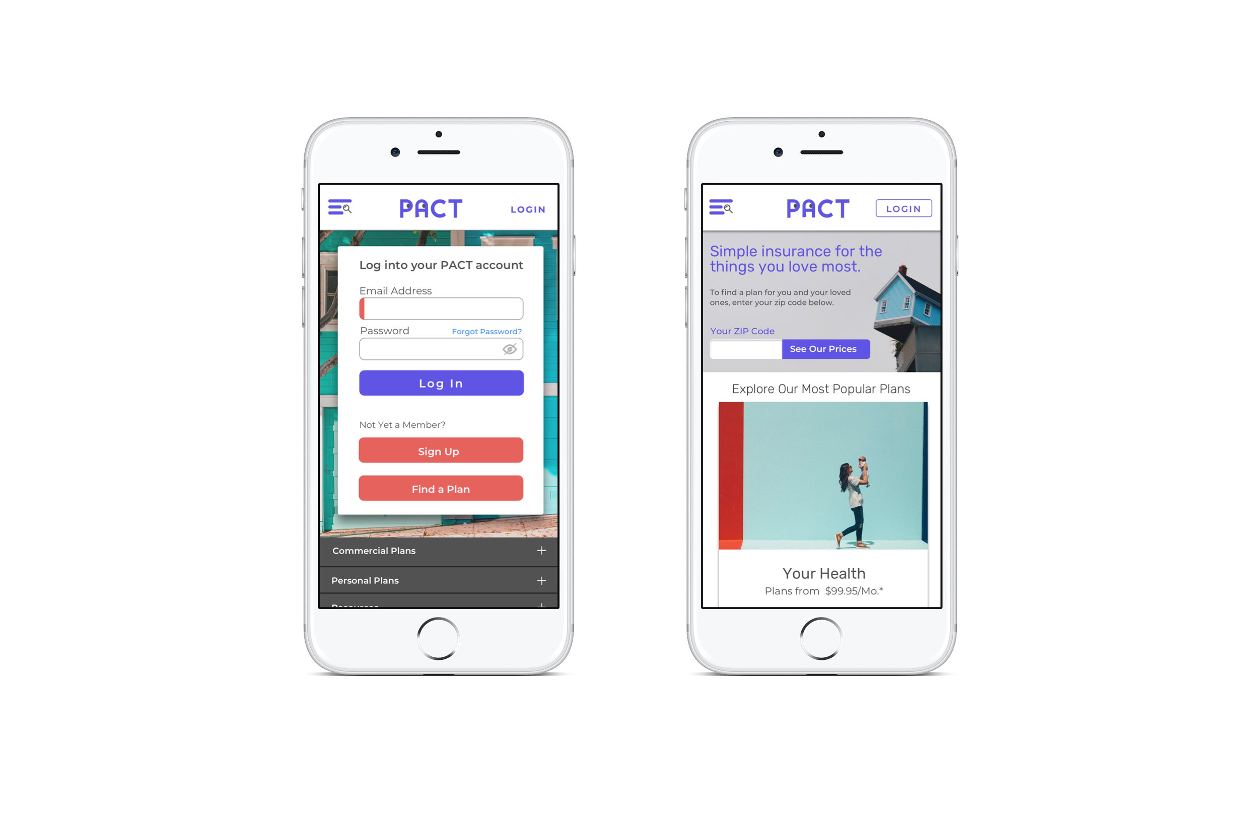
Interactions were designed for 3 key tasks: registering a new account, logging into a pre-existing account, and purchasing a renters insurance policy with $20,000 in annual coverage.
Rapid Prototyping
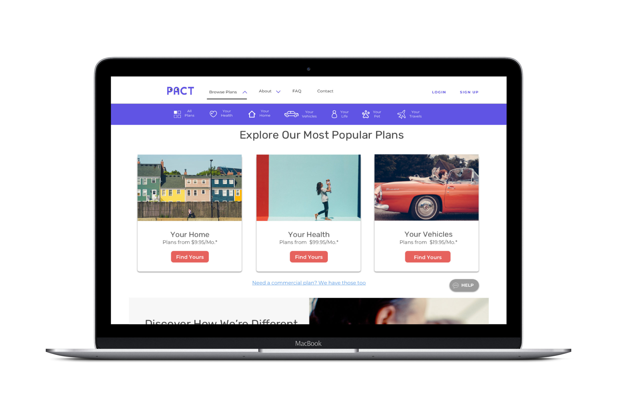
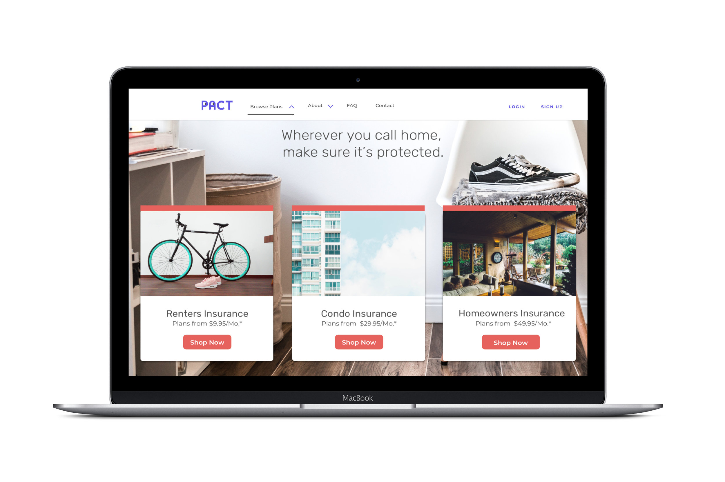
Selection of Key Screens from the Desktop Prototype
The Invision prototype was tested 1:1 with users across the country to gauge participants’ ease of use navigating the site and completing the specified tasks.
The primary goals of the usability tests were to:
- Evaluate participants’ impression of the overall UI (color, layout, typography, etc..)
- Identify possible friction points in the sign up, login, and checkout flows
- Determine participants’ primary entry point to the renters insurance product page, so as to streamline the product discovery experience
Participant overview
- 5 participants in total, 4 women and 1 man
- All participants lived in either San Francisco or New York
- All participants were relatively tech savvy, having worked in the tech industry and/or Silicon Valley at some point in their careers
- Age range was relatively narrow due to tight turnaround time (27 - 31)
Key takeaways:
- Nearly all participants clicked on “Browse Plans” in the top navigation to make their way to the category pages
- Only one participant clicked on the “Your Home” product card to access the policy categories, as opposed to using the top navigation
- All participants mentioned liking the “modern” and “clean” look of the UI
- 100% of participants were able to register a new account by clicking on the “sign up” button in the top right corner of the homepage
- 100% of participants were able to log into their account, beginning on the homepage. This seemed to be the quickest and most natural of the 3 task flows for users.
- 100% of users were able to locate the renters insurance product page, accurately select the middle policy option with $20,000 in annual coverage and complete the checkout flow
Usability Testing
Following the results of the usability testing, small tweaks were made to the existing screens to optimize the prototype’s navigation. This included: modifying the sign up and login options in the top navigation, standardizing button colors across screens, and reducing the number on input fields on the checkout screen to minimize user friction. The resulting designs were redlined using Sketch’s Zeplin plugin, and readied for handoff to the development team.
